The Form Designer is a tool used to create and edit interactive forms. It leverages the component design features in the .NET Framework to provide a consistent, familiar user interface that allows complex form designs to be created without requiring any programming on the part of the user.
The user interface is divided into these major areas:
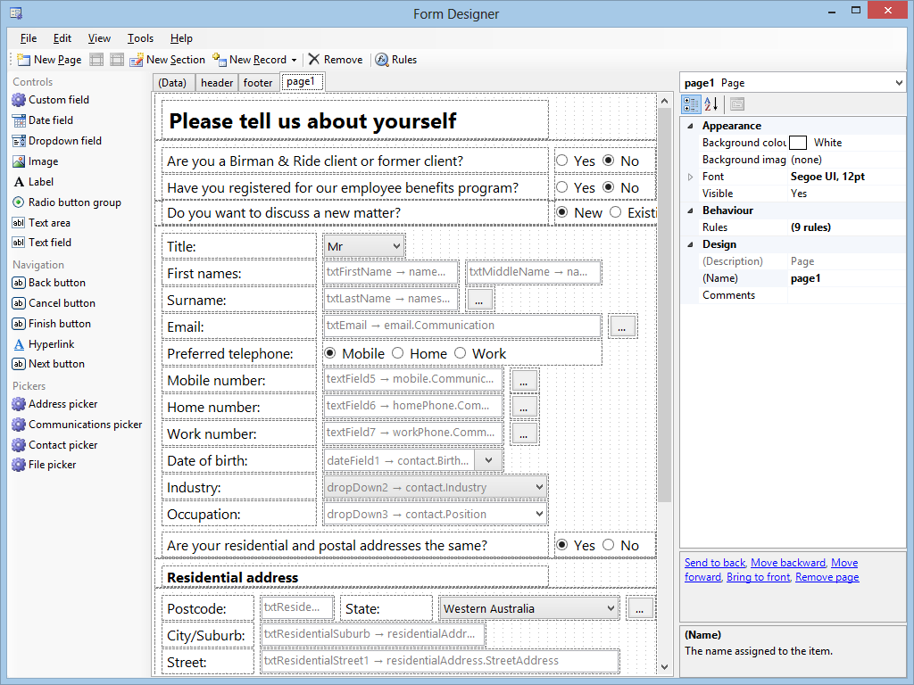
- Main menu - Provides access to functionality which affects the overall design of the form, including saving/reverting changes and clipboard operations.
- Toolbar - For accessing frequently-used commands, creating pages/sections/records and managing rules.
- Toolbox - Shows the types of controls that can be added to the form.
- Page tabs - Switches between the pages of the form and the record editor.
- Design area - WYSIWYG editor that allows you to reorder, reposition, scale and arrange the content of a page.
- Properties pane - Lists and edits the properties for the component(s) currently selected in the design area. You can also use the properties pane to switch to a particular component that you wish to edit.
Toolbox
The toolbox is the starting point for adding controls to a form. Controls may only be added to a
section within a page, therefore you must add at least one section and switch to the desired page before you can proceed.
Clicking one of the toolbox items will enter 'tool mode' and cause the item to appear selected. The cursor will change to a crosshair when you move the mouse over the design area, and clicking within a section will cause a control to be placed at the location of the cursor. This leaves 'tool mode' and you can reposition/scale the control as desired.
Design area
The content of the currently-selected page appears in the design area, and reflects the appearance of the controls when the form is started by the user. However, the design area adds some visual hints to assist in the design process:
Dashed borders to show the page boundary and (if configured) the right margin
Dashed borders around each section
Dots for each grid square. The grid simplifies the placement of controls by aligning them to the nearest dot. (You can change the grid dimensions or switch it off entirely)
Control points ("glyphs") on the currently-selected control which can be dragged to change its size
Watermark text on some controls to show the name of the control and, if set, the binding between the control and a
record
Properties pane
Each component you add to a form has a set of properties which allow you to configure and customise them to suit your design. While the WYSIWYG editor can be used to set some of the visual properties (e.g. location, size), the bulk of the properties are set using the grid. For some properties, you simply enter text, however for more complex properties you may see a dropdown arrow (▼) or an ellipsis symbol (…). Clicking this will allow you to select from a series of options or display an editor.
Properties are arranged by category, but can be displayed alphabetically if desired. When a property value appears in regular typeface, it is the default value for that property. If bold, the value has been changed. Properties with grey text cannot be edited.
A list of additional commands for the selected component(s) is displayed below the property grid. These can be used to move sections up/down, change the order of controls, create new rules and more.
At the very bottom of the properties pane, an extended description of the selected property is shown. This contains important information about the meaning and semantics of the property.
Shortcuts
The Form Designer supports a range of keyboard/mouse shortcuts, including:
CTRL+click selects multiple controls in the design area
Arrow keys nudge controls by one pixel at a time
Delete removes the currently-selected components from the form or, if editing a property, resets to the default value
F1 shows help
F2 allows you to rename the currently-selected component
F4 switches to the properties pane
F5 previews the current design of the form as if it had been started by a normal user
F7 checks for possible design errors
See also
Interactive Forms Framework